Speaking with graphic designer Jeroen Kummer (Kummer & Herrman) about his pivotal role in The Sochi Project and the latest yearbook The Secret History of Khava Gaisanova and the North Caucasus
The Sochi Project & its publications
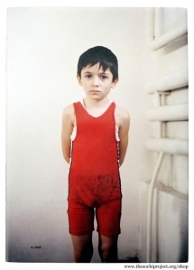
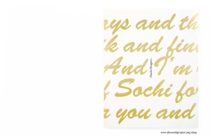
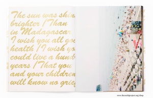
In the realm of the long-term documentary research project, co-authored by historian-writer Arnold van Bruggen and professional photographer Rob Hornstra, almost each calendar year a ‘year publication’ is launched, since 2009. And from 2011 onwards one or more ‘Sketchbooks’ have been published. Starting with the latter, KIEV (2012, Sketchbook Series #3) is a tribute to analogue photography, summer, tourism and glamour in Sochi. Life Here is Serious (2012, Sketchbook Series #2) is a portrait of young wrestlers and of this popular sport in the North-Caucasus. Safety First (2011, Sketchbook Series #1) consists entirely of contact prints from negatives damaged by X-ray scanners in Grozny.
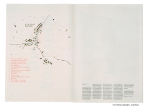
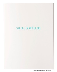
And looking at the yearbooks: In Sochi Singers (2011) the mundane, capitalistic nightlife is played out versus authentic Russian musical tradition and folklore. Empty Land, Promised Land, Forbidden Land (2010) is a bulky publication on desolate Abkhazia, sitting on the north shore of the Black Sea. Depicting a region after the violence in a civil war between this country and Georgia in 1992-1993. On The other Side of The Mountains (2010) is a newspaper, when unfolded it’s a mural revealing a story on Krasny Vostok, where either gas or electricity power is hardly available. And that village is less than 200 km of lush resort Sochi. The very first yearbook, and sold out now, is Sanatorium (2009). A sober publication devoted to the smeary sanatoria in subtropical Sochi, previously meant for the wellbeing of Soviet workers.
Mirelle Thijsen (MT)
Could you explain to me, by and large, what The Sochi Projects entails?
You are collaborating from the very start with documentary photographer Rob Hornstra and historian/writer Arnold van Bruggen on this major documentary research project, this epic story.
Jeroen Kummer (JK)
What is remarkable about The Sochi Project, and what makes a long-term project like this significant, is its journalistic value. It is both a photo documentary and a journalistic work-in-progress. In the choices we made we took both aspects into account: how to write a narrative history with text and images.
The concept of The Sochi Project is outstanding, and as such distinctive from many other documentaries. The decision alone, to start a long-term documentary, and collaboration for a five-year period, and tempting to invoke spin-offs, is unusual. It is remarkable that from the very start Rob and Arnold had the intention to collaborate together with our office, Kummer & Herrman, for five years, the full term. Which has been colouring the effect of partnership quality since.
MT
Why did they come to your office?
JK
There are undoubtedly several reasons. Before starting The Sochi Project we have custom designed several photo books, in particular the publications made for WassinkLundgren, like Empty Bottles (2007/2008), which is questioning the phenomenon ‘photo book’. The publication is a clear example of this quest. On one hand the purpose of a photo book is serving the narrative. On the other hand, the way this publication is bound is unusual and it serves at the same time as an exhibition.
MT
Much like On The Other Side of The Mountains?
JK
Yes, that idea is expressed in there, but in quite a different way. These types of straightforward decisions must have ignited the ambition of Rob and Arnold. After a collective meeting, while brainstorming, their decision to work with Kummer & Herrman was made. From that point on the collaboration was unconditional: no probation. This working attitude generates a high energy level among all the participants. Mind you, at the start of the project we were not involved in making publications. We have designed the website and pushed forward the crowd funding system, through web accessibility. In fact, we started out making promotional items.
MT
The idea of crowd funding came from Kummer & Herrman or from the authors?
JK
The idea to raise project finance through crowd funding came from Arnold and Rob. However, the way to implement that and develop multiple platforms, and not in the way crowd funding systems are available now, has been supervised by Kummer & Herrman. As well as developing the language needed to entice an audience.
MT
May we look now at the content of The Sochi Project? So far we talked about logistics and collaboration. Would you please elaborate on the content?
JK
First of all it is a way to map, in journalistic terms, the area around Sochi. And in such a way that is quite distinct from the approach of the official Olympic channels by the International Olympic Committee. The Sochi Project is an effort to tell stories which are not to be told, nor published, by these channels. Secondly, the aim is to create a new audience for these kind of provocative and sensitive stories. And thirdly, at the beginning the focus was on Sochi and the effects on such a resort city of being awarded the Olympic Games 2014. In the course of years, the focal point has shifted and The Sochi Project involves wider political issues and conflicts prominent in the region. This means, not in the first place, personal stories about people deprived of their property, because the government has confiscated their homes in order to built Olympic stadia, but like in the recent publication on the North-Caucasus, sketching a region of change that for hundreds of years has been a thorn in the side of the Russian regime.
Furthermore, what makes The Sochi Project so outstanding is its long-term effort to collect multiple stories, in order to obtain different gradations, attempting to determine lighter and darker tones of a story. And of course, this project is aimed at Sochi, but I can think of the same systematic approach and methodology suitable for a different region, in another country.
MT
Finally, could you describe, from your point of view, what the contribution of Arnold and Rob is to The Sochi Project? And to what extent they each have room to manoeuvre in the framework they created for this documentary?
JK
They unite in a project, which is unmistakably their collective project, although, each of them, at different times, has a leading role and must carry the load. Rob is more involved in the visual aspects of The Sochi Project, due to his background. For example we have made sub plots like Sochi Singers (2011). This is an explicit visual document, and the contribution by Arnold is limited, but substantial. While The Secret History of Khava Gaisanova and the North Caucasus (2013) is an in-depth story Arnold wanted to tell regarding this region. In this case he is taking the lead. In fact, all books are the final result of their collective endeavour.
MT
Let’s now focus on the most recent publication, you just mentioned: The Secret History of Khava Gaisanova and the North Caucasus and the authors position on collaboration with you has resulted in, elaborating on problems, solutions and results.
JK
The breeding ground for each new story, for new journalism, is Rob and Arnold travelling together through the region. While travelling, text and images are collected. During this phase, at Kummer & Herrman, we gain insight into a work-in-progress, the nature of text and image production for a book. In this case, the text, the stories, the chapters, are a guiding principle. Looking at The Sochi Project books published thus far, two publications are the most hybrid books, in terms of being both a reading book and a visual narrative: The Secret History of Khava Gaisanova and its pendant, the publication on Abkhazia: Empty Land, Promised Land, Forbidden Land. The latter also predetermined the outline for The Secret History of Khava Gaisanova; achieving a substantial historical component in the book. Along the way, the meeting with Khava has raised the entire scope of the story to another level. So, on one level you have the history of the North-Caucasus and the bilateral relations with Russia, throughout the centuries. Explaining large-scale historical change. But on another level, on a personal level, the cover story of Khava unravels, and that of her family and her husband who disappeared. The tragic life of the protagonist in this story is symbolic for that of many other families in the North-Caucasus. Meanwhile it is a beautiful parable in itself, finding close kinship with the larger history. We, the Kummer & Herrman team, don’t consider it our duty to guide that process, but we do communicate on the story gradually taking shape, the chance in structure, hence Khava becoming part of the narrative.
The next step in the decision-making process is text production by Arnold. We don’t interfere in that. With Rob I discuss the photo editing. It was a challenge for him how to document the history of the Caucasus and how to fit that into the larger picture. In addition, a narrative, being it a location-based production, by a documentary photographer is definitely contemporary. The protagonists in the pictures are the people living there right now. So the question is how to weave their stories with the historical chapters? For example, there is a chapter on the Islam. How do you depict a religion, generally equated with violence, in a broader social-historical context?
Thus it became imperative, deciding in an early stage, which book technical aspects are suitable for the story to be told. In terms of size, binding, printing, colour, etc. In this case, because it is tagged as a reading-book, there are restrictions regarding the size. It has to be portable and handy; a book you read in the train, one that fits in your pocket. The length of the stories and the amount of photographs determents the size of the book. A particular feature of this book I like to mention is, that it is published in both a Dutch and an English edition simultaneously. Thus far, all publications covering The Sochi Project have been published in English, with an initial print run of a thousand to twelve hundred copies. Regarding The Secret History of Khava Gaisanova, the authors worked for the first time together with a publishing House (Pegasus), exclusively for the Dutch edition. This implies the print run has been doubled.
MT
Why?
JK
One reason is the authors intend to broaden their audience. Secondly, a separate Dutch-language and English-language edition has emerged from a grant offered by the Fonds Bijzondere Journalistieke Projecten (Fund for Exceeding Journalistic Projects). To receive such a grant, is dependent on the condition to produce a Dutch-language publication in cooperation with a publishing house. All these issues are arising, and are influential in shaping a photo book. Everything considered this is the first time we make two editions in two languages. One of the challenges is to find a way to solve the bilingual aspect. Another is to reproduce Rob’s photographs on newsprint. We have had some experience with this printing procedure during The Sochi Project, trying out different possibilities. At the very start we made an introduction pamphlet on newsprint. A first major publication is the multiple use newspaper The Other Side of The Mountains. And last November, at Paris Photo, his photographs were presented at Flatland Gallery on newsprint as well.
The technical aspects and aesthetical qualities of Rob Hornstra’s documentary photography are strikingly in contrast to the roughness of newsprint. At the same time you might consider this technology-based solution a vehicle, a means for the pictures to transmit the storyline. And because he formalizes new photographic aesthetics, his pictures stand out. Which is a quality per se, but as soon as they are integrated in a publication, there certainly is a type of friction.
MT
Would you please elaborate on the typography in The Secret History? Similar to the one used in On The Other Side of The Mountains. Titles and quotes are in both publications prominent, even monumental I would say. Like the header on the front page of a daily newspaper: bold and penetrating.
JK
Newsprint was chosen for many reasons. This way we captured the journalistic gut feeling of the publication.
MT
Oral history is of major importance throughout the entire Sochi Project, and very present in the form of quotes in the layout.
JK
Yes, and in this case the personal quotes, titles and main text are printed using the serif typeface Times New Roman, a newspaper typeface by excellence. This is the first time we use that typeface for The Sochi Project.
And because the text in this recent publication is substantial, we work with a compact framework for column width, and by using the Times it will remain readable. This layout enables the reader to consume the text. It serves its purpose. Still, this book does not have the format for a novel, a non-fiction book. Those are smaller in size.
MT
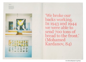
Quotes are printed in bloody red? It makes them look rough, sober, straightforward and non-artificial. You’re not trying to polish the story.
JK
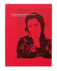
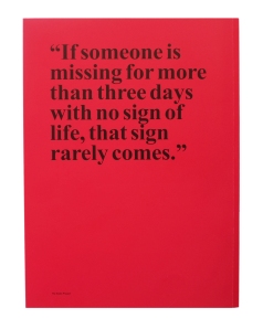
Yes, indeed. Like the red cover, showing a portrait of the young and beautiful Khava, but with a haunting look in her eyes. A sign, you could say, indicating the horrifying experiences her family is dealing with. The colour red is representing that life full of misery on the cover and in the quotes. They have the same roughness. This story of Khava Gaisanova is the most terrifying of all the personal histories collected so far in The Sochi Project. People disappeared, others slaughtered. As a graphic designer you’re looking for a framework, a form, justifying these impressive quotes. Like this one on the back cover: “If someone is missing for more then three days, with no sign of life, that sign rarely comes.”
These book-technical matters, for example choosing a printing mode, also have to do with financial considerations. Production wise, newsprint suits the nature of the story: it sustains its sobriety. Newsprint in a low-cost, non-archival paper used to print newspapers. And frankly, it makes it possible to print two editions. Now we have two editions for the price of one. Realising a project of this magnitude, you continuously face financial pressure. Just imagine, this book is printed on a huge newspaper press, as big as a gymnasium. A Dutch and English edition, printed side by side, on a gigantic press in the form of a print roll. The illustrations are identical for both editions. And regarding the text, the advantage of newsprint is, the text ink plate, in black, simultaneously substitutes a red ink plate for the quotes. So for many reasons, producing a book this way has been quite appropriate.
MT
Who is choosing the quotes? And who edits the image sequences?
JK
First of all, both Arnold and Rob choose the quotes. Both authors highlight them. While editing the book, I also make suggestions. And text wise, quotes are collected, selected and written down by Arnold.
MT
Meanwhile, you must have a scenario for each calendar year regarding The Sochi Project.
JK
Regarding the Sketchbook series, from the start of the project the intention has been to publish one book a year. In The Sochi Project terminology we speak of the ‘year publication’. The Secret History is in fact the one covering 2012. So this year publication has been launched a little later. The intention refers to the offer made to our silver and gold donators that receive each year a free copy by surface mail, as service on return for their financial contribution. On the contrary, the Sketchbooks have been released much later, in 2011. This idea came about during the years of economic crisis, when financing the yearbooks became more problematic, due to dramatic cuts to art budgets. Grants to art publications are no longer issued. Besides, The Sochi Project maintenance depends in part on crowd funding, not entirely. Donators finance the travels and the story collecting. The publications are subsidised separately. When Sochi Singers was being produced, mid 2011, we realized we will have difficulty financing the publication. So we had to change course. There are many options. One is recruiting more donators. Finally we decided to launch a new series of booklets, covering smaller topics, intimate stories, which never fitted in the larger context of a yearbook. Initially these were posted on The Sochi Project website, but they deserve to be published.
All these booklets of similar size, about A5, are sold for 35.00 EUR each, which is a considerable amount of money. By buying one, you support the project. Up to now we have made three Sketchbooks. The last one is KIEV. They are meant to be lightweight and happen to be very successful.
MT
What is planned, regarding the Sketchbook series?
JK
Probably one or two more Sketchbooks will be launched. One subject, for this series of booklets, we already have worked out, is a giant hotel in Sochi, with an inexpressible name. In an earlier stage of The Sochi Project, Rob has already made photographs of striptease dancers working in the hotel. It’s a building with nine hundred rooms or more, two nightclubs, three restaurants: a world of its own. Built in the Soviet era. Quit a fascinating complex. So one of the ideas is to make a booklet on this hotel, focussing on the architecture as well, mapping the different floors, in order to capture the megalomaniac scale.
In regard to the yearbook, which will be published later this year by Aperture, and we’re honoured because of that….
MT
Isn’t that against your principles? All photo books by Rob have been self-published. This is Rob Hornstra in a nutshell.
JK
Yes, a bit of opportunism here! We did have our doubts, eventually, but on the other hand, a final publication certainly needs marking a turning point. It will still be a true The Sochi Project publication, produced by the same team. Meantime it is a retrospective as well, looking back on the past five years and incorporating the integral project. You may find pictures that have been published in The Sochi Project books at an earlier stage. That only counts for a small part. Most of it is new and unpublished material. The aim is to map the area; the title of the final yearbook is An Atlas of War and Tourism. Indeed, this publication is different in nature. Important stories and sub plots from the region will be included. Another intent is to reach a larger audience. Thanks to Aperture a wide distribution and a print run of five thousand copies is possible. With self-publishing I don’t think such high figure print run is feasible. Besides, I think self-publishing is and remains a strong power tool.
MT
So Kummer & Herrman carry out the graphic design, am I right?
JK
Yes, the same team.
MT
Will you have carte blanche? In other words, how does Kummer & Herrman play a major role in the representation of the work by Rob Hornstra?
JK
In principle, we are given carte blanche: no restrictions, no preconditions. Although Rob does have a clear image of the way in which his work is to be published. He has a leading role in the process of compiling a book. He pushes the boundaries of his photography, with a view to his work being merged in the integral project, serving the overall story. Publishing his work on newsprint was a logical choice made along the way in order to shape The Sochi Project. Rob has a strong opinion about the purpose and aim of his work. And sometimes it needs a poor reproduction quality to proclaim the message. Pegasus, the publisher, was not beyond any doubts, when it comes to the ideal way of printing a photo book.
MT
But HOW do you tell Rob’s story? Is it different this time, compared to, let’s say, the Sochi Singers, or Empty Land, Promised Land, Forbidden Land. Does it at all relate to the way you work on a scenario per publication?
JK
Each publication is an entity, and not only should we tell Rob’s story, but the story of The Sochi Project as a whole. None of The Sochi Project publications are to be considered classical photo books. They all consist of different components, and contain a variety of histories. In this respect they are comparable in nature. On the other hand, the making of is quite different in each case. There is no fixed format. Regarding the Sochi Singers, Rob was uncertain whether to publish them, because these pictures are of a typological kind. In editing that yearbook, I had an extensive role.
Please realize a strong cooperation is required in how to outline a publication. Editing and design are not split tasks; Rob, Arnold, Arthur [Herrman] and / or me are involved. And yes, you could call it a ‘scenario’, in terms of choices that have to be made, but the way the process of book production develops is different each time.
MT
Let’s take The Secret History as a case study: what choices have been made, how did the process unravel?
JK
In The Secret History the text is directive: the narrative structure is carried by the text. At one point, a major decision was taken: incorporating the personal history of Khava. Then, the booklet inserted in the year publication was eventually planned as a quire, prior to binding. As the texts in the book consist of two different levels, these images, being reproductions of a small family photo album found in Khava’s home, represent a different level than the documentary photography by Rob. In this way the facsimile is both part of the integral publication, and a separate unit. As I explained earlier, the stratification in the text consists of two kinds of chapters: one written from a historical perspective on the Caucasus, the other focussing on the tragic family history of Khava Gaisanova. And chapter titles are respectively printed in black, and in red. In fact, the new journalistic epic story versus the family history is represented in the structure of the book. And of course, this is not a fixed format. Rob also took pictures of family members, personages in the street, but the booklet is definitely a jewel devoted to amateur and family photography. And this idea for the insert sprouted from the story development.
MT
The photographs are not entirely full bleeding images.
JK
Using newsprint full bleed on both vertical sides of the pages is not possible. What you see is the rough unfinished edges of the newsprint, literally, the edge of the print roll. I really like that aspect. So you have to check all possibilities taking into account the negative format Rob is using. Images are only full bleed on the upper and lower side of the page. The result is a kind of roughness that suits the project.
MT
And sometimes there is the amount and use of white space on a page. Like page 201, the title for chapter 11: ‘The Islam’.
JK
Chapter number and title in a header, is what you mean. I like that very much, the content of the book gains strength by this kind of ‘unfinished’ page. We had a discussion whether to number the different chapters or not, I was a proponent, because numbering supports the storyline, the sequencing of chapters. If you would open the book and just read ‘The Islam’, it is an odd cry.
MT
I consider the numbered chapters suitable for a historical overview….
JK
Yes, indeed.
MT
The density in black ink is not always equal.
JK
You have to realize the newspaper printer is an enormous machine, stamping away. The print runs of such a machine usually is 20.000 and more. The print run for this publication is peanuts: 1100 copies are printed in 20 minutes! And it delivers standard newsprint quality, with fluctuations inherent to the printing process, including spots. It is a hybrid product: newsprint bound at the bookbinder. And that requires guidance.
MT
For commodity use.
JK
Yes, indeed. That’s it!
Image selection and reproduction by The Sochi Project

